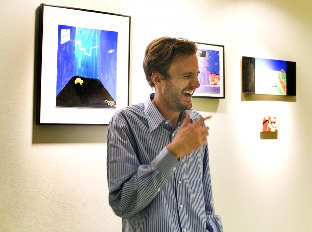
The artwork adorning the walls on the lower level of the SUB is intended to make the viewer uncomfortable, artist Charles Ellis said. Ellis, a special education major, said he wanted to recreate the uncomfortable feeling video games gave him as a kid. The Daily Lobo sat down with Ellis to discuss Sega Genesis and modern art.
Daily Lobo: So, to begin, could you go over some of the video game influence in your art?
Charles Ellis: Yeah. I used to be a cartoonist, so for a decade I was just doing all black-and-white drawings, trying to figure out how pictures went next to each other. I never knew anything about color. So, one day I decided, “OK, I’m going to paint instead.” I had a really bad color sense. And I remembered when I was a little kid, seeing ads for the Sega Genesis, which I never had: “Wow, those colors are amazing. they’re so vibrant, and the games are so creepy. They’re so much weirder than Nintendo or anything like that. I wish I could have one.” So I got one on eBay, and I hooked it up in my apartment, and I started pausing game screens and painting other things in those colors. Like, I would use the colors of a paused Sonic the Hedgehog screen to paint a tree. And in doing that, I had to figure out how reds went next to greens and how to make a more jarring effect or a more unifying effect. I did a few of those and started to get a better color sense. And as I was doing it, I really found a lot of the little tricks they did to make kids interested in these games visually.
DL: Did you have to mix colors together to match the Sega Genesis colors, or is there like a Sega Genesis color pack you can buy?
CE: Not as much as I thought. Sega Genesis used a lot of unmixed colors. I never had to do anything with red. Red was always red. So my first videogame paintings don’t have a lot of mixing, because I didn’t have to for a long time.
DL: What are some of the techniques used in the Sega Genesis to create that feeling of weirdness?
CE: Well, Sega Genesis used a lot of purple, first of all, which was really jarring to me because I had always played a lot of Nintendo, and Nintendo was mostly grays and blues. So seeing all this purple all over the place just struck me. The characters were bigger, and there was a lot of realistic stuff next to unrealistic stuff. I mean, there would be a really well-realized background next to, like, a tree that looked exactly like a tree, or a really detailed building next to a trash can that’s just a square.
DL: What attracted you to making the art more uncomfortable for the viewer? Is that an accurate description?
CE: Yes, it is pretty accurate. That was just what I remembered about my earliest impressions of video games. They were exciting to me because they were uncomfortable and frightening, and I didn’t quite feel at ease when I was looking at them. That was the reason I wanted to find out more about the stories. I just thought there was more to them for that reason.
DL: One of your plaques says that there’s an element of Southwestern art that’s like a “comfort food” element. What do you mean by that?
CE: The best example I can think of is the Frontier Restaurant. And that’s kind of unfair, but a whole lot of New Mexican and Southwestern art is using a lot of faded colors, a lot of comforting imagery, a lot of really smooth compositions where you look at it and you feel at ease, like you’re in a nice armchair or something. And I kind of feel like that’s why a lot of people like Southwestern art. But there’s a lot of really creepy stuff in the Southwest. I’m sure there are artists that have done a lot of really cool stuff with that, but I haven’t exposed myself to them.
DL: So what kind of creepy stuff do we have here?
CE: You can just really tell that this place has a violent history and its own — I don’t know how to put this — There’s a lot under the surface in a lot of places here.