Here at UNM, we're a week into our extended spring break, and I've spent all of my time in my room writing about math. And if you know me, you probably knew that I was going to spend my break this way, pandemic isolation or not.
Before I get into it, let me just say this:
I know everyone is afraid, confused, upset and probably feeling a little panicked. Don’t get me wrong — I am, too. This is a global catastrophe, the likes of which recorded history rarely sees.
And because of this, I understand that graphs aren't exactly everyone's main concern right now. The problem is that I'm seeing a lot of numbers flying around with little clarity, which I can only imagine is going to cause more panic as we barrel into a national scenario that's absolutely going to get much, much worse before it gets any better.
Let me take a moment to explain what I mean.
The folks working on the COVID Tracking Project (CTP) are doing one hell of an important job right now. For those unfamiliar, the CTP has tasked itself with recording and publishing daily COVID-19 testing data in the United States and its territories. While testing reports and recording methodology varies from state to state, the CTP has created the most useful and reliable resource for us to develop an understanding of where the U.S. population stands as we size up the outbreak.
While the information that they're making available is obviously valuable, a data set this versatile in nature lends itself to misinterpretation and misrepresentation.
Tipping the scales: interpreting case-count data
I could hand my editor a 6,000-word lecture on what I just said, but I'd rather just show you.
Here's an example of what I'm trying to explain.
This is the daily number of confirmed cases recorded in the U.S. since March 4 — the first day on the CTP report — through March 22.
Get content from The Daily Lobo delivered to your inbox
Obviously, that's a pretty scary rise. The number of positive cases reported in the U.S. has essentially doubled every two days. And while there's value in knowing the raw number of confirmed cases, using this information on its own can quickly lead one to think of an imminent, unavoidable doomsday scenario.
Truth be told, this doomsday may very well happen. But looking at the number of positive cases alone leaves out key factors that prevent us from seeing a bigger picture.
Right off the bat, it's vital to distinguish between confirmed cases and active cases. The former represents the total number of positive tests, while the latter subtracts those who have already recovered from the disease (to date, very few in the U.S.) or died. In other words, active cases refer to the number of confirmed cases still awaiting a result — recovered or the opposite.
Another factor is a major lurking variable contributing to the vast increase in positive tests, being (naturally) a significant increase in the number of tests administered over the same time.
If the same number of tests were being recorded every day, then the vast increase in confirmed cases would be a major statistical anomaly, not to mention an even more insurmountable crisis. But that isn't the case.
The number of tests given has trended over time similarly to the number of positive cases. It's pretty simple: the more tests, the more confirmed cases.
That said, there are still bad ways to visualize this. A lot of people, including (redacted local news source) around these parts have been using bar charts to show the number of total tests and confirmed cases on the same scale (see below).
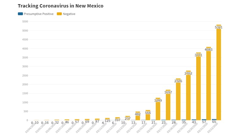
The problem here? It's almost impossible to see the little blue sliver representing the number of positive cases, due to the low proportion of positive tests. Because both of these metrics are progressing at similar rates at vastly different magnitudes, it's better to illustrate their growth on a logarithmic scale, shown here.
Despite the fact that the total test metric completely overshadows the positive test amount in magnitude, the logarithmic scale shows the rate of growth in both metrics. This way, we can make an effective comparison without compressing the lower values into the very bottom of the graph.
What I'm saying here is that just looking at the standalone confirmed tests and cases metrics isn't quite as useful (at least as far as predictive applications are concerned) as looking at the confirmed case growth as a percentage of the total number of tests given.
Take a look below at the percentage of confirmed COVID-19 cases in the U.S. graphed for both the running percentage (red) and the percentage of positive tests recorded on each individual day (gray).
It goes without saying that the individual day-to-day metrics are more volatile, simply because we can expect some days will always return higher values than others. What we're really focused on here is the red line — the total running percentage of positive tests — which has so far hovered reliably between 10% and 15%. The confirmed cases are, to date, coming in at a rate which we can reasonably expect.
The rise in confirmed cases is more a result of testing increases than it is an indicator of the actual spread of the disease. With this and the idea that it's overwhelmingly likely the majority of active COVID-19 cases in the U.S. are still untested and unconfirmed, we can't make any qualitative judgments on the true rate of the contagion's transmission in the U.S. based on confirmed cases alone.
In essence, my point boils down to this: For my money, "Confirmed cases are coming in at an expected rate" is more accurate (and a lot more comforting to hear) than "confirmed cases of COVID-19 are doubling every two days in the U.S."
Mapping it out
In the same vein, I've seen some misleading outbreak maps, where folks are reporting the raw number of confirmed cases in different states or provinces. Cartographer Kenneth Field touches on this in a pretty detailed set of recommendations for mapping COVID-19 responsibly, with the main takeaway being that you have to normalize regional case data.
In other words, instead of looking at the number of confirmed cases on its own, you should look at the number of confirmed cases per every n people, as Field illustrates here.
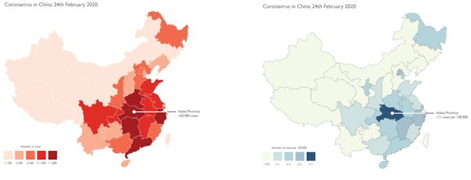
The maps, both illustrating the same number of cases in mainland China through February 24, seem to tell different stories. The map on the left uses raw case data and paints a dire, sensationalized picture.
Meanwhile, the map on the right uses normalized data, in this case being the number of confirmed cases per 100,000 people in each province. Here, we can see the importance of distinguishing between the basic number of cases and the density of these cases relative to a region's population.
Here's an example taken from (the same redacted local news source) this week.

Here, they're using the raw case numbers for each county, which makes Bernalillo County look like an absolute death zone. What this map doesn't illustrate, though, is that Bernalillo County is by far the most populated county in the state, which would naturally lead to a higher number of cases.
On top of that, they use red. This is more of a personal issue that I have with this graph. Red is a more sensationalized color scheme, which Field alludes to. Representing the numbers this way, it's clear that the above map is misleading and very well could lead Bernalillo County residents to panic even more than they already are.
On the flip side, here's a normalized county-by-county case density map, updated daily here alongside a bunch of other COVID-19 data visualizations courtesy of the Daily Lobo.
This map paints a completely different picture. Sure, Bernalillo has the most cases of any New Mexico county, but it's also home to over 600,000 people. The real takeaway here is that cases are more evenly distributed in that area of the state in terms of density. There's a slight outlier in Socorro County, which is home to under 20,000 people and two active cases as of March 22.
Even with this adjustment, it's important to realize that it's still early on as far as testing in the United States is concerned, which can still lead to misinterpretation.
Just take a look. As of March 22, here is the number of confirmed cases for every million people in each state in the union.
Now, that's all fine and dandy, but even this map can be misleading. This is largely due to the very fact that the U.S. is (quite frankly) laughably far behind the rest of the world in COVID-19 testing. The map above would suggest that places like Texas and West Virginia are relatively untouched, which in itself is a dangerously short-sighted assumption to make.
Here, again, we see another lurking variable at play: These states are even further behind in their testing, skewing even the normalized figures.
Each state is listed here in order of the population-relative testing conducted in each state as of midday yesterday.
Not coincidentally, a lot of the states with a low number of confirmed cases per million residents are also the states with the least-sufficient testing thus far, though even that water is a little murky. Some of the states administering tests are receiving low-positive returns, while others seem to be using limited testing resources on already-compromised individuals with strong symptoms.
One part of this is due to the U.S. being early on in its fight against the pandemic, and another part of this trend is due to how quickly attitudes within the U.S. have shifted in the past week or so as the disease continues to become a reality. Some states have adapted to testing much faster than others, which is clearly contributing to the discrepancy in testing (and, by association, confirmed case) density.
Visualizing a snowballing crisis
One thing we do know is that, as of March 22, the amount of active cases in the U.S. has grown by a daily factor of above 1.3 since testing data started getting recorded, meaning roughly that the active case count doubles every three days. This rate of growth has grim implications for the U.S. healthcare infrastructure. A CDC report released last week noted a 12% hospitalization rate for early returns in U.S. COVID-19 cases. If this trend were to continue unabated, then the hospital system in the U.S. would be overwhelmed within weeks.
We can examine this through the lens of per-1,000-people estimates for available hospital beds in the country, where census data marks that the U.S. has roughly 2.4 hospital beds available for every thousand people in the country.
If we normalize the portion of active cases in the country to a per-1,000 basis and project its growth at a conservative growth factor of 1.3, then the math shows that the entirety of the country's hospital system capacity would be met in just a few weeks. Even if the 12% estimate is way off by a factor of two in either direction (6% or 24%), the time difference is just days.
Now, there are a few glaring disclaimers here.
First, this doesn't take into account the preventative measures already taken in the U.S., like the stay-home orders in New York and California that were enacted over the past few days. Additionally, this logic would assume that the hospital beds are evenly distributed throughout the country, which is also false. The national average is 2.4, but New Mexico, for example, is home to just 1.8 hospital beds per 1,000 people (the country's third-lowest mark), while South Dakota comes in at 4.8, the country's highest mark.
The purpose of this very simple metric is purely illustrative, not epidemiological, showing just how quickly the U.S. hospital system as a whole could get overwhelmed if drastic measures aren't taken immediately.
With that said, it's important to also note that the roughly two-week incubation period of the disease will likely create a similar lag between the enactment of preventative measures and for their effects to take place.
Oof. There's a lot of variables here.
So, can I say for sure that the available data can help us predict what's going to happen? Of course not.
But what I can say is that it's absolutely vital that we develop an understanding of how to represent this data as it evolves in real-time, both in order to stay informed and to mitigate any unnecessary panic in a time already full of necessary panic.
At this point, it looks as if the United States is following in Italy's footsteps, which is ostensibly not where we want to be. And we're a lot closer to being an Italy than a South Korea.
It's astounding that the first confirmed cases of COVID-19 in the U.S. and in South Korea were reported on the same day, but South Korea's already flattened its curve while the U.S. active case count continues to skyrocket — a function of the United States being very slow to acknowledge the outbreak's threat.
Again, it's still early on. The case data will make itself more clear as time goes on, but the time to get a grip on the data has long since arrived.
Nobody can say for sure what's going to happen. We've never seen something quite like this before. While we can take a number of preventative measures, only time will tell how effectively this can negate the effects of the pandemic.
In the meantime, stay safe, stay informed, and for god's sake, please stop buying all the toilet paper.
Joe Rull is the sports and data editor at the Daily Lobo. He can be contacted at sports@dailylobo.com or on Twitter @rulljoe