

More Sports Teams
Culture
Fine arts students face unique challenges, new perspectives with distance learning
Liberty Stalnaker | August 30Methods of learning and practice have changed radically for University of New Mexico fine arts students because of distancing procedures amid the coronavirus pandemic in the fall 2020 semester. As a plethora of courses are now being held primarily or solely online, students in hands-on art studies have voiced a number of concerns with the quality and value of their current education. Photography major Elizabeth Wilkinson said distanced learning affects not only the production of her art, but the nature of her creativity. "When I'm around other people, I get most of my inspiration and most of my motivation, so not having those people around has been a huge burden on my work," Wilkinson said.
News
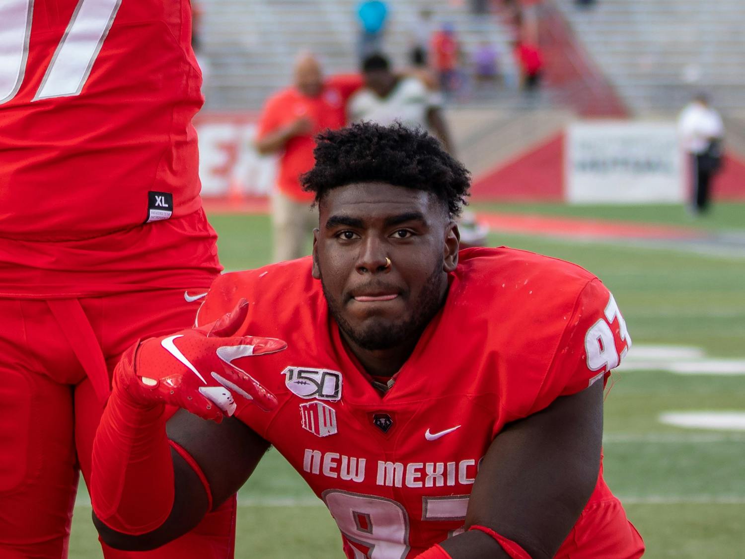
Medical examiner says no CTE in Flowers autopsy
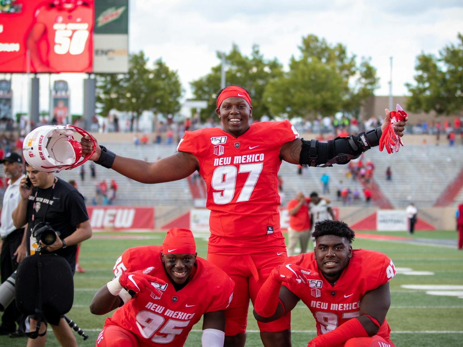
Hevyn Heckes | August 30Editor’s note: This article contains discussion of suicide. If you’re feeling suicidal, you are not alone. Please call the National Suicide Prevention Lifeline at 1-800-273-8255 or UNM’s Student Health and Counseling at 505-277-3136. On Aug. 25, famed attorney Ben Crump announced a wrongful death lawsuit regarding the November 2019 death of former University of New Mexico football player Nahje Flowers. The suit alleges that Flowers suffered from untreated and/or undiagnosed chronic traumatic encephalopathy (CTE) — a neurological disorder common in athletes who participate in contact sports such as boxing or football — due to repeated head trauma during the course of play in his capacity as a defensive lineman for the Lobos.

News
As mass eviction prospect looms, Albuquerque protest calls for rent, mortgage cancellation
William Bowen | August 30DOWNTOWN — As the coronavirus pandemic continues to rage across the nation, the United States is staring down the barrel of another crisis: a wave of evictions and foreclosures. Almost half of New Mexicans have experienced a loss of employment income since the pandemic began, according to Census Bureau ...

Culture
SHAC attempts to assuage student anxiety with new ‘HonesTea with SHAC HP’ podcast
Samuel Fleig | August 30Student Health and Counseling (SHAC) at the University of New Mexico recently released “HonesTea with SHAC HP,” a new podcast that reassures students that they are not alone in their struggles and anxieties when facing this most unusual school year amidst a pandemic. In the “Welcome Back Lobos” episode, SHAC student-employees Tiffany Martinez, Chris Naranjo and Leah Adent host the podcast (available on Spotify, Apple Music or Amazon) and discuss their thoughts and worries about the fall semester in a casual and relatable format. Martinez poses several questions to her fellow hosts about their feelings on returning to a campus absent of the educational and social opportunities many students have relied on to get through the stress that comes with school and work.
Culture
‘Fallout’: New book sobering reminder of nuclear devastation 75 years after entering atomic age
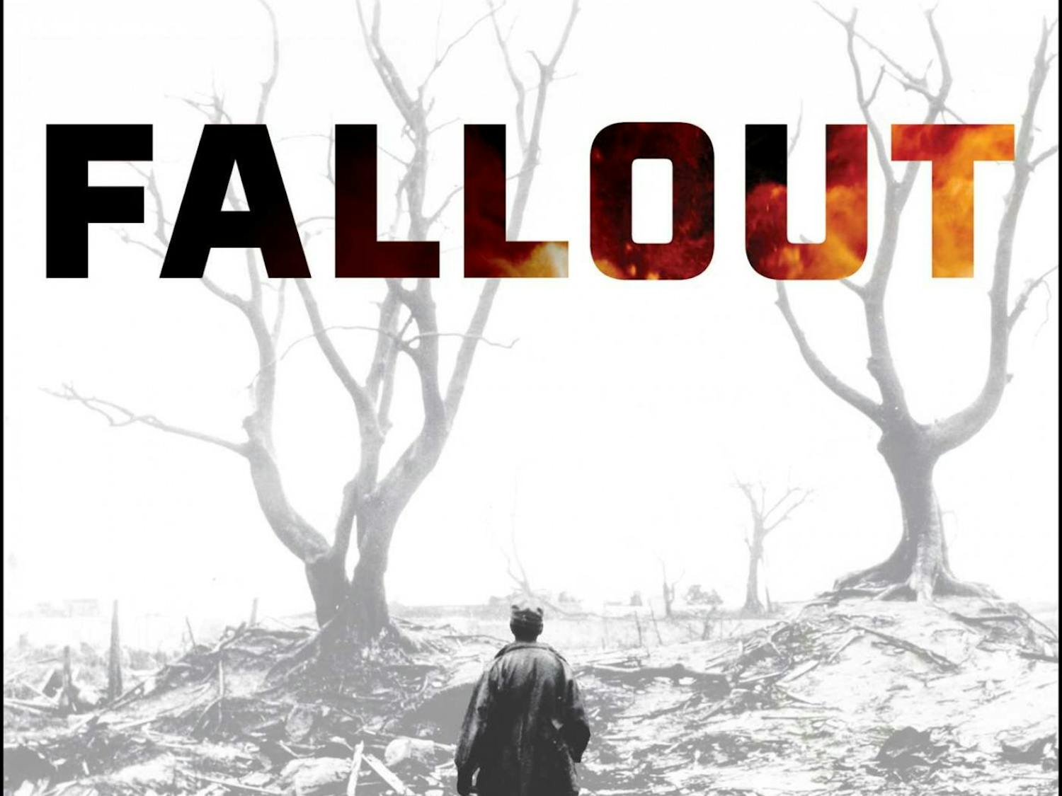
Hevyn Heckes | August 30Editor’s note: This book review contains graphic depictions of violence. New Mexicans are perhaps more acutely aware of U.S. nuclear capabilities and the bomb, “Little Boy,” dropped on Hiroshima, since its predecessors were developed and tested in our own backyard. However, most people alive today will not remember the immediate aftereffects of the outsized attack on Japanese citizens that capped off the second world war. Modern awareness of the atomic bomb and the events of WWII are mostly relegated to fictionalized accounts contained in films such as “Pearl Harbor” and “Schindler’s List.” The events surrounding WWII have long since become a cultural legend, and first-person memories of these events no longer exist. We’ve simply forgotten the horrors of global war — until now.
Culture
Black Student Alliance focuses on campus diversity, inclusion amid BLM momentum
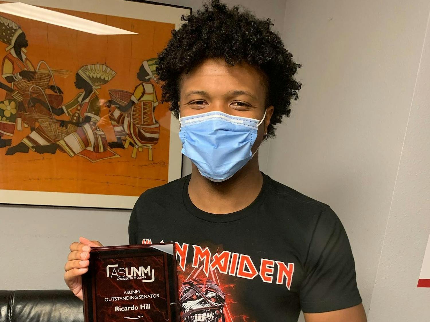
Jasmine Casillas | August 30The Black Student Alliance (BSA) at the University of New Mexico is focused more than ever on the necessity of diversity at UNM. The organization has already gotten to work alongside the start of a largely online fall semester amid the coronavirus pandemic. The BSA is open to all Black students but mainly consists of leadership from other African American student organizations on campus. Its mission is to tackle oppressive issues that affect all of UNM, according to member Ricardo Hill. This semester, the BSA is focusing on what ASUNM can do for the student body to implement inclusive legislation before they move on to working at a larger scale, like taking issues directly to the University. They are also focused on emphasizing the importance of showcasing diversity at UNM by hiring more Black faculty, and restructuring the way UNM markets to new students to include diversity in recruitment.
Culture
UNM professors share the highs and lows of online instruction
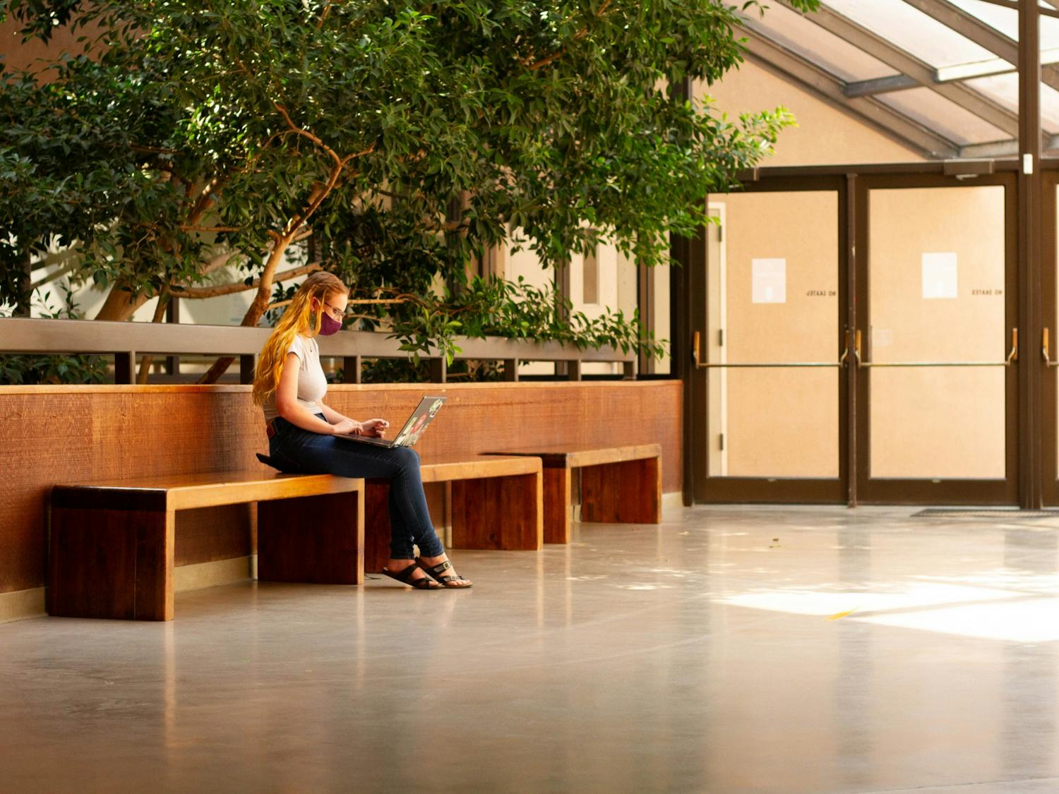
Beatrice Nisoli | August 30Life goes on as students and faculty adjust to the University of New Mexico’s hybrid semester, performing small group discussions in Zoom breakout rooms and submitting assignments from the comfort of their own bedrooms. While technological issues and network timeouts may plague students’ academic experience, on the other end of the screen, professors are also having their fair share of remote learning-based woes. Professors were given a few weeks to tailor curriculum to a virtual format last March, when the University officially shut down in response to COVID-19 cases reaching New Mexico. Instructors utilized the following summer months as an opportunity to finesse online instruction for the upcoming semester.

News
COVID-19 campus testing available as UNM gears up for outbreaks
Lissa Knudsen | August 28As student newspapers across the nation push back on administrators and media accounts that are framing party-going students as responsible parties for university COVID-19 clusters and outbreaks, the University of New Mexico’s Student Health and Counseling (SHAC) is busy gearing up its diagnostic testing capacity. UNM opened up a mobile testing site in UNM’s C Lot — located at the corner of Las Lomas Road and Redondo Drive – earlier this week. With the prospect of imminent outbreaks and clusters like those seen at universities across the country, UNM is putting plans in place to stem a potential tide of cases that could arise from continuing in-person classes.

Culture
‘Big Lebowski’ screening really ties the room together at Fusion Forum
Samuel Fleig | August 27As New Mexico nears its sixth month of lockdown, many residents are eager to get out of their homes and experience what the city has to offer without compromising the health and well-being of others. Local performing arts theatre company Fusion Forum has made this possible with outdoor film and movie screenings. Fusion showed the Joel and Ethan Coen classic “The Big Lebowski” on the evening of Aug. 23 and plans to continue the trend by showing the pilot episode — as well as the final episode of “Breaking Bad” — on Aug. 29 at 7:55 p.m.

Culture
Pandemic continues to wreak havoc on vibrancy of Albuquerque arts scene
Megan Gleason | August 27New Mexico is rich in culture, but the coronavirus pandemic has put that to the test by transferring the Albuquerque art scene to an online environment. “We’ve all experienced such a dramatic shift in our daily lives. Everything about how we interact and how we plan and how we move through space and our ability to travel — it’s all changed so much, so quickly,” Diana Gaston, the director of the University of New Mexico’s Tamarind Institute, said. “In the arts community, I think we’re still grappling with some of those changes.”

Culture
Pick-your-own small farm operation gains popularity as pandemic wears on
Lissa Knudsen | August 26For the past few weeks, people from all over the Albuquerque metropolitan region have been flocking to Heidi’s Raspberry Farm in Corrales early on Saturday mornings to pick pints of tart, delicate raspberries. Pick-your-own (PYO) or you-pick operations like Heidi’s have been allowing people to head to the fields to harvest their own produce across the state. Unlike many other retail businesses, the COVID-19 pandemic hasn’t put their operation on hold.
News
Prominent civil rights attorney files wrongful death lawsuit on behalf of Nahje Flowers’ estate
Hevyn Heckes | August 26On Tuesday, famed attorney Ben Crump announced a wrongful death lawsuit regarding the November 2019 death of former University of New Mexico football player Nahje Flowers. Crump’s firm has represented such high profile cases as Trayvon Martin, Michael Brown and the children from the Flint water crisis. The defendants are the NCAA, former head football coach Bob Davie and the UNM Board of Regents. The complaint alleges that the defendants were negligent in the case of Flowers’ suicide and that the NCAA was negligent in cases of other premature deaths of student athletes under their supervision.
Culture
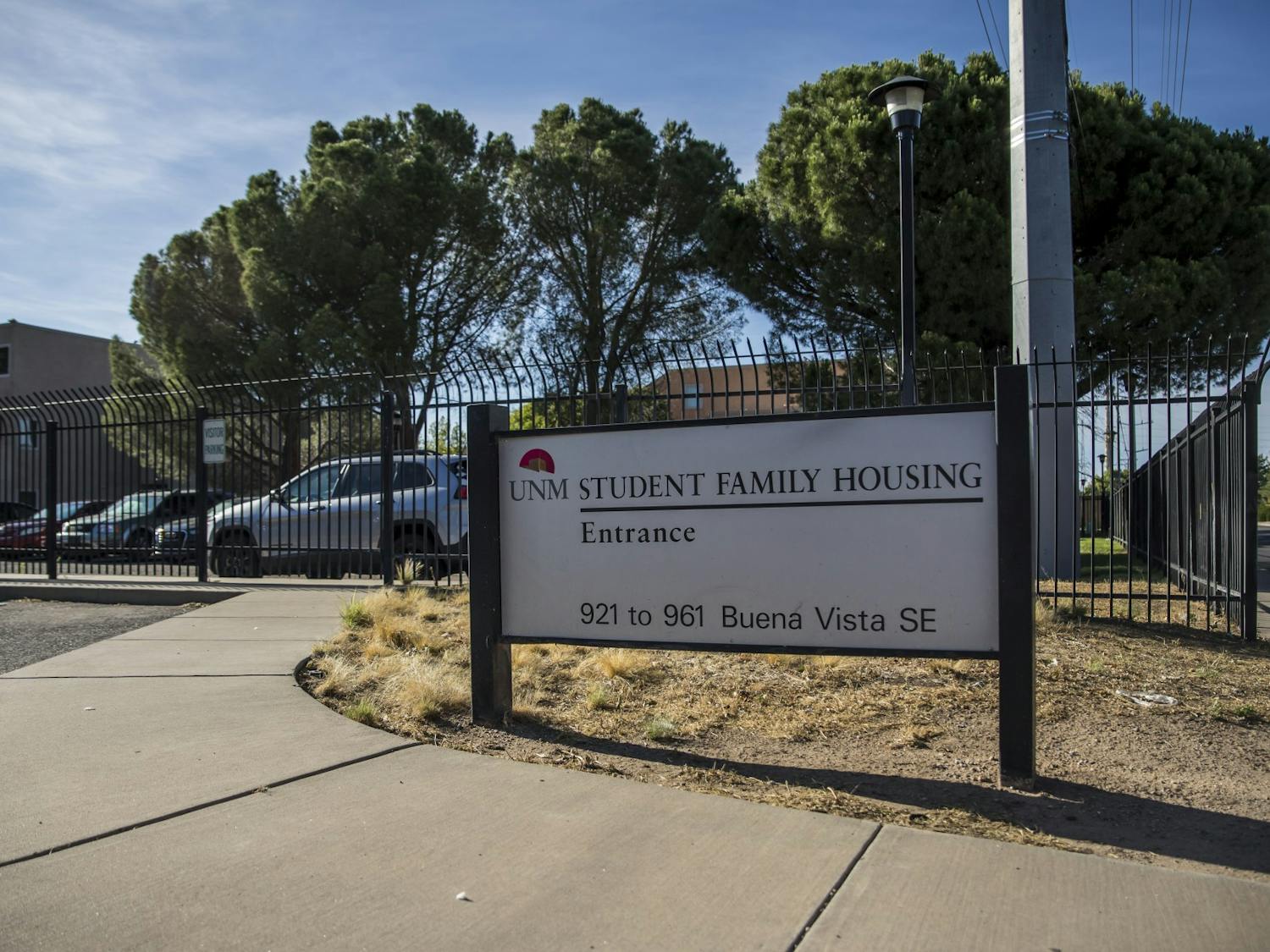
International students face daunting financial, legal woes amid Student Family Housing shutdown
Hannah John | August 23International students are facing a difficult financial situation with the looming shutdown of the University of New Mexico’s Student Family Housing (SFH) in May 2021. According to international student and SFH resident Sherry Shafique, students within the complex were informed through a newsletter in June that UNM couldn’t afford the repairs that SFH needed. A majority of the tenants at SFH are graduate and international students, according to Shafique. International students face unique circumstances with the oft-maligned complex being shut down, forcing them to find another suitable place to live with their families. Most of these issues revolve around financial hardships and having to abide by different laws than students who are from the United States, such as language barriers and academic or visa requirements.

Culture
Sigma Gamma Rho sorority recharters
Beatrice Nisoli | August 23Sigma Gamma Rho Sorority, Inc., a historically Black Greek-lettered sorority, was rechartered at the University of New Mexico on March 28. The non-profit organization was founded by seven schoolteachers during the perilous thickets of segregation on Nov. 12, 1922 at Butler University in Indiana. According to the sorority’s official website, "Sigma Gamma Rho Sorority's aim is to enhance the quality of life within the community. Public service, leadership development and education of youth are the hallmark of the organization's programs and activities. Sigma Gamma Rho addresses concerns that impact society educationally, civically and economically."

Opinion
LETTER: Complete your 2020 census for our Lobo community
Daily Lobo Reader | August 23Lobos: We urgently need your help! It’s not too late to be counted! The deadline to fill out the census is rapidly approaching (Sept. 30, 2020), and New Mexico is in danger of losing critical federal dollars. If our state loses federal funds, our University of New Mexico community loses federal funds as well. So, what is the census, you might ask? The census is the once in a decade opportunity for us to re-shape our communities. A simple, 10-question questionnaire determines how more than $800 billion in federal funds get distributed across our country. In New Mexico alone, the 2020 census will determine how more than $7 billion per year gets distributed to our state. As students and members of the Lobo community, the census impacts us directly, as it determines how much funding is in: • Medicaid • Supplemental Nutrition Assistance Program (SNAP) • Federal student loans • Pell Grants • Temporary Assistance for Needy Families (TANF) • Many more programs that we and our families use
Culture
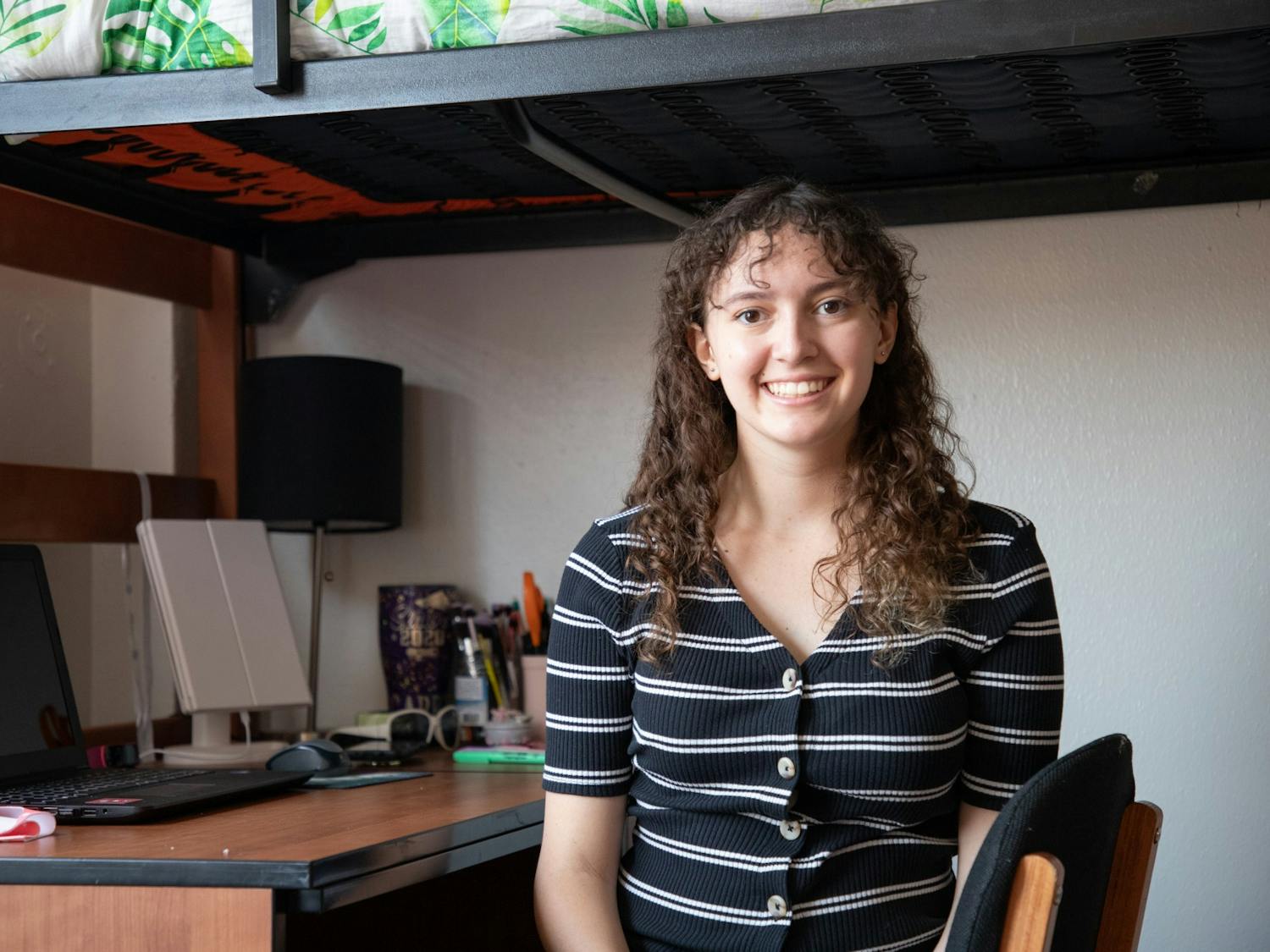
Seclusion, stress and stringent regulations: A day in the COVID-19 dorm life
Kyalynn Moore-Wilson | August 23Isolation is the new normal for students living on campus at the University of New Mexico. Leaving a dorm room has become a rare occurrence, and UNM is providing limited housing along with a laundry list of new rules and regulations because of the coronavirus pandemic. All students who wanted to live on campus with housing managed by Residence Life and Student Housing had to sign an “addendum and amendment” alongside their regular dorm lease. This legal document laid out some new rules, which include a mask requirement when outside of a personal room, only one guest at a time in personal rooms, no guests that live outside of the dorm building and only one person in an elevator at a time.
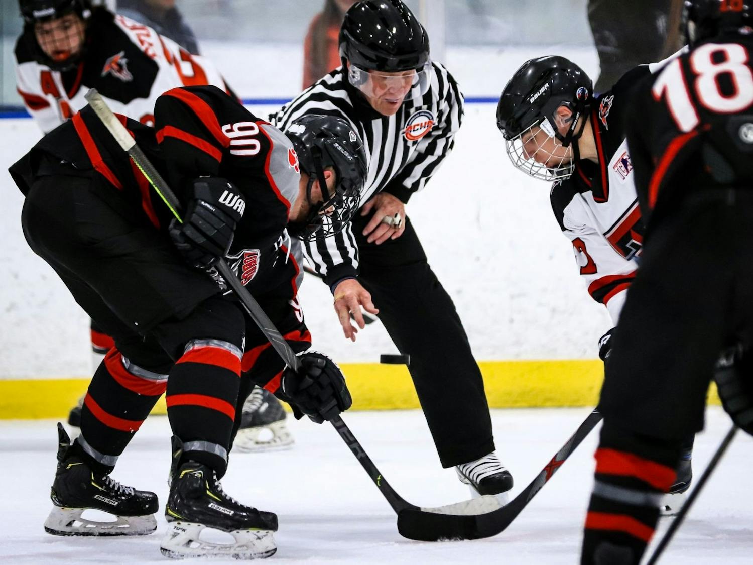
Sports
UNM club hockey fall season suspended
Gino Gutierrez | August 23The University of New Mexico’s men’s club hockey team has decided to suspend the fall portion of its season. The team announced the decision on its official Facebook page on Aug. 18, becoming the latest UNM team sport to fall victim to COVID-19’s effect on the competitive sporting landscape. In the post, head coach Grant Harvey cited the team’s decision to comply with the University’s policy regarding contact sports as the reason for the fall season’s postponement. “It's with heavy heart that I relay that Lobo hockey will be suspended for fall to comply with our school's policy with contact sports,” Harvey wrote. “I know that many conferences have followed suit, and I have to support UNM's decision and hope to face a spring semester in a safe manner.”

News
Faculty union, administration agree to pandemic guidelines
Gabriel Biadora | August 23UA-UNM and the administration reached the agreement just as numerous colleges and universities across the United States have been plagued by coronavirus outbreaks forcing them to shift to online instruction only. Schools like the University of Notre Dame and the University of North Carolina at Chapel Hill have reverted to online classes following a growing outbreak and clusters of infections, respectively, according to the New York TImes. Other universities, like Smith College in Massachusetts, announced plans for an entirely online 2020 earlier this month prior to the school year. Several have opted for a delay in the semester, like Winthrop University and the University of California, Merced.
News
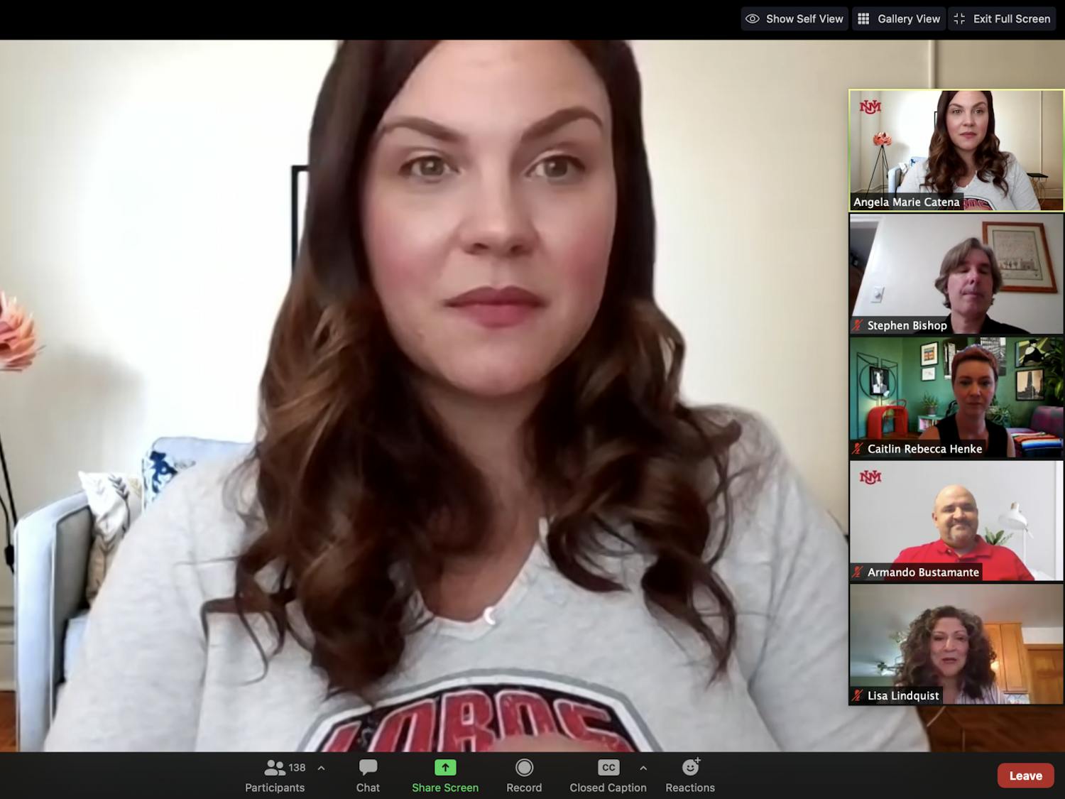
UNM town hall addresses ‘gross,’ controversial Title IX changes
Bella Davis | August 23The U.S. Department of Education announced a series of controversial changes to Title IX — a civil rights law prohibiting sex discrimination at federally funded educational institutions — a little over three months ago. Under the new regulations, colleges are now required to hold live hearings in sexual assault and harrassment cases and must allow for cross-examination. The University of New Mexico hosted a virtual town hall on Friday that addressed those regulations — among other new, contentious requirements — and how UNM is responding. Hosted by Angela Catena, UNM’s Title IX coordinator with the Office of Equal Opportunity (OEO), Friday’s town hall featured one faculty member and three advocacy center staff members who emphasized that the new regulations will not affect the services and support they provide students.